Editorial Content & Illustration System
Clearpath is a fictional mental health platform aimed at working adults navigating burnout, anxiety, and life transitions.
This self-initiated project was designed to demonstrate editorial content design for the health and wellness space, an area where clear visual hierarchy, accessible language, and consistent brand application across high-volume output are essential skills.
The goal was to build a three-card social media content system covering the three most common post types in health-adjacent brands: educational, data-driven, and awareness.

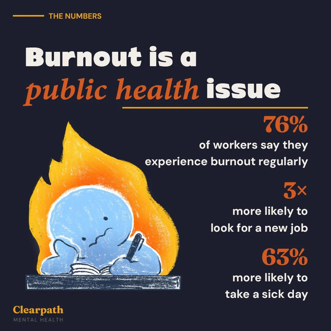
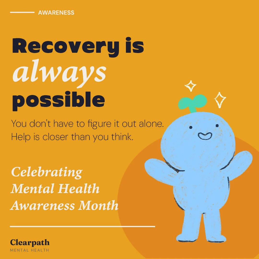
The illustration
Rather than sourcing stock imagery, I created original illustrated characters for the project. The blue figure surrounded by flames became the visual metaphor for burnout — overwhelmed, a little sad, but still recognizably human. Designing the characters first and building the card layouts around them meant the illustration and the design system informed each other rather than one being added on top of the other.
Design decisions
The palette was pulled directly from the characters themselves: the amber and flame-orange of the fire, the cool blue of the figure, and a warm navy for grounding. Fraunces was chosen as the display typeface for its warmth and personality — it reads as trustworthy without feeling clinical. DM Sans handles all functional text, keeping the cards readable at small sizes on mobile screens.
Each card uses the same underlying grid and brand elements — tag line, headline, illustration, brand lockup — but with enough variation in layout and color to feel like a living content system rather than a single repeated template.